Establishing Design System
And Team for a Top-Tier
Cybersecurity SaaS
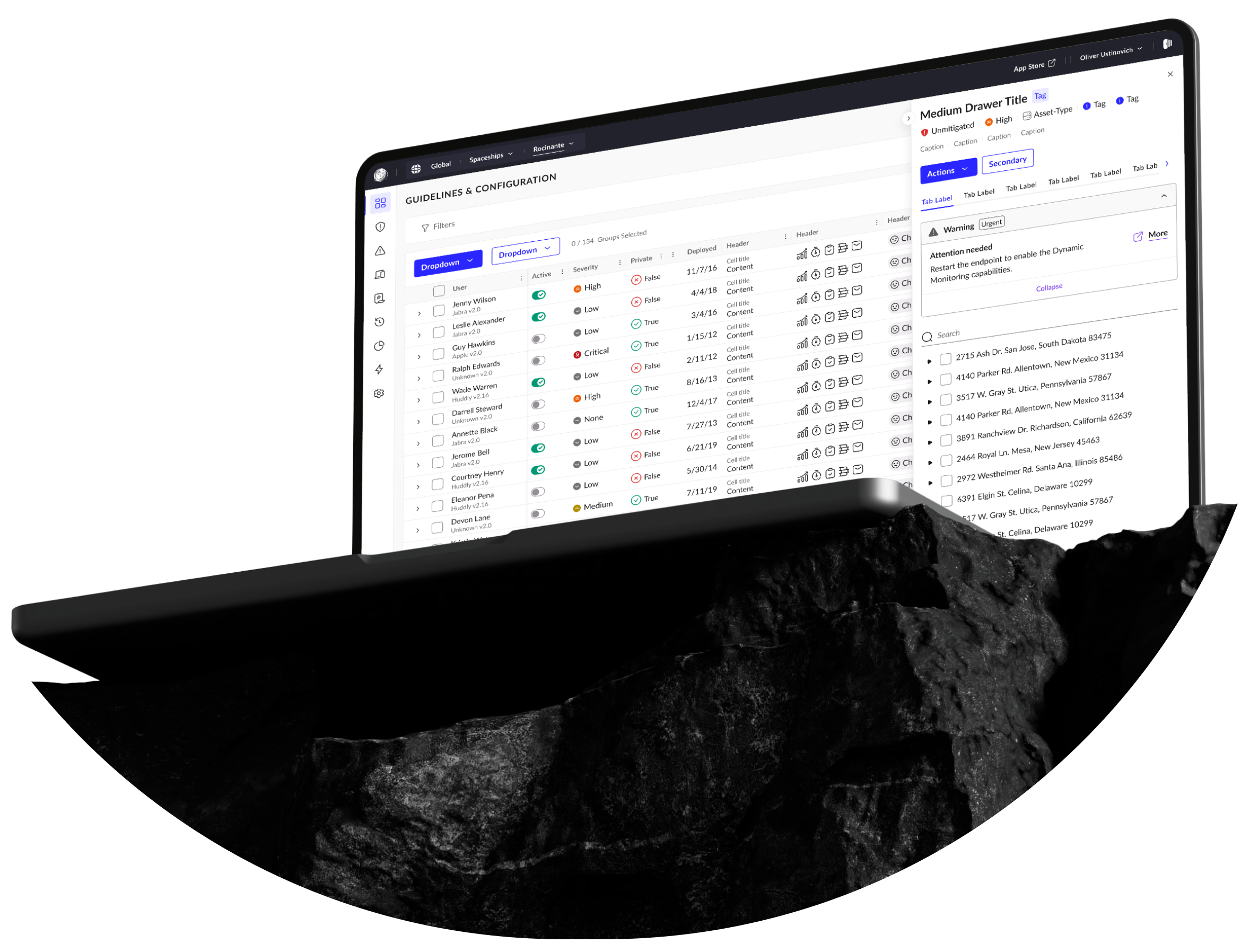
From 2022 to 2024, I worked at a leading cybersecurity company, where I was responsible for establishing a new design team in Prague. This team was formed with the goal of transforming the company’s platform and creating a dynamic, scalable design system. Built to support the company’s rapid growth and changing needs, the system was designed as a “living organism,” continuously adapting to new challenges and opportunities.
Over time, the scope of this initiative expanded to include critical aspects such as accessibility, localization, and enhanced navigation systems, ensuring a seamless and inclusive user experience for a global audience.
This case study delves into the journey of developing the design system and transforming the platform, highlighting the challenges, solutions, and the lasting impact of these efforts in the cybersecurity domain.
Problem Definition
Company Buy-In
Selling a long-term, costly initiative like a design system is no easy feat. Product companies prioritize profit, and at first glance, this didn’t seem like a direct moneymaker. But a shift in perspective made the case clear: inconsistent UI was costing millions annually, wasting time, and creating chaos across the organization.
While the design team was largely on board, leadership turnover brought challenges. Each new director and VP had different goals, and I had to continually advocate for the system’s importance. The tipping point came when accessibility became essential for EU and US government contracts. What was once a “nice-to-have” became a legal and business necessity.
Numbers can help make the case even stronger: streamlining UI would save millions annually by reducing maintenance time and increasing efficiency. Beyond compliance, accessibility opened doors to a broader market, reaching the 15% of the global population living with disabilities while avoiding fines and reputational risks.
A poorly executed UI can cripple a SaaS product. A well-designed system, however, drives scalability, accessibility, and efficiency—laying the foundation for sustained growth.
Exploration
Despite a decade in operation, the company lacked mapped user journeys, a pattern library, or a meaningful component library. What existed was a disorganized Figma file where anyone could add, alter, or break components—no QA, consistency, accessibility checks, or support. It was a blank slate with scattered pieces.
To kick things off, I conducted research to understand user needs, behaviors, and pain points. Through conversations with stakeholders, PMs, and executives, I mapped key user journeys, cataloged components, and identified the most complex parts of the UI to test improvements.
I introduced a style guide to define a clear visual language and applied it to the most intricate pages to validate its effectiveness. A use-case-driven approach ensured every decision was grounded in practical application.
As the team began to form, we identified potential bottlenecks and planned additional resources to ensure the processes we were building could scale effectively.
Architecture
Serving both design and engineering teams meant our architecture needed to work seamlessly for both audiences. We tackled several key topics to ensure this:

Numbers can help make the case even stronger: streamlining UI would save millions annually by reducing maintenance time and increasing efficiency. Beyond compliance, accessibility opened doors to a broader market, reaching the 15% of the global population living with disabilities while avoiding fines and reputational risks.
A poorly executed UI can cripple a SaaS product. A well-designed system, however, drives scalability, accessibility, and efficiency—laying the foundation for sustained growth.
The central library housed styles, core components, hidden sub-components, and guidelines. While improvements were possible, it introduced innovative ideas that became foundational for future systems. I envisioned separating styles into their own library to better support federated management, but for the time, this structure served us well.
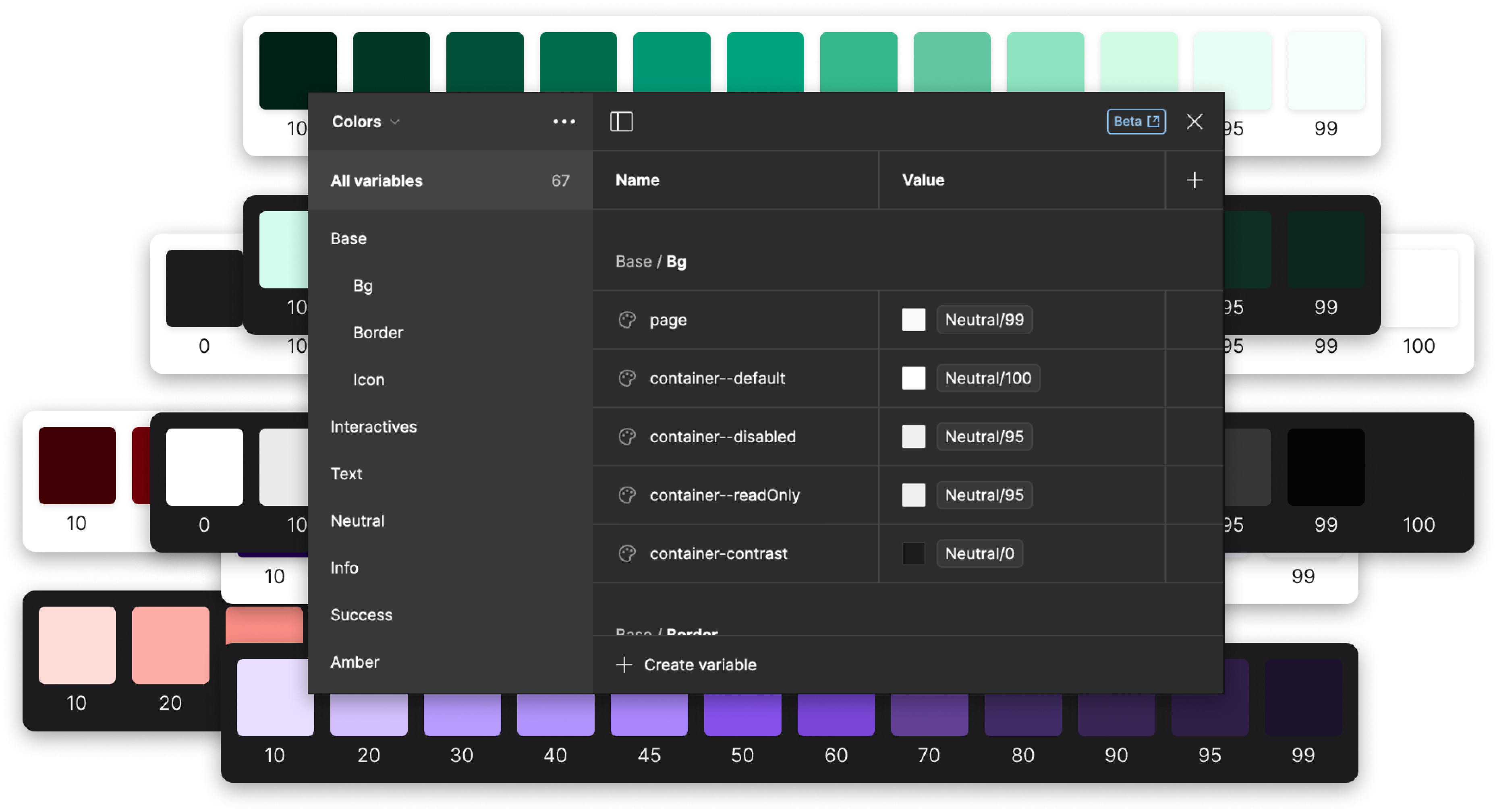
We developed a unique naming convention and organization for design tokens, taking a semantic approach aligned with engineering standards. This method enhanced consistency and collaboration. The effectiveness of this system inspired an article I later wrote, detailing the process: The Ultimate Guide to Design Token Organization.
We began experimenting with a federated approach. Core libraries (styles, core components, visual assets) were centrally managed, while non-core libraries like console patterns and data visualization emerged. Although contribution standards were still evolving, the groundwork was laid for a scalable model.
We created a three-tiered documentation system: quick references in Figma flyouts, detailed component descriptions on the component page, and comprehensive guidance in Storybook for designers and developers. Component designers took ownership of this, ensuring clarity across teams.
This architecture wasn’t without room for growth, but it laid a strong foundation, introducing revolutionary ideas I still use today.
Let’s do it!
Every project is special and very different in many ways. So its journey. Choosing the right people for a project though makes the journey worth it.


