I design the systems that make big products feel like one.
More than eighteen years designing products, the last four in enterprise cybersecurity, where complexity is highest and consistency matters most. I build design systems, lead the designers who use them, and build the processes that keep both healthy.
Every system starts as a tangle.Untangling it is the job.
Now
Senior Product Designer, Lead · CrowdStrike
Before
Manager, Product Design · SentinelOne
Based
Barcelona · CET · Working across Europe
Languages
English · Czech · Russian
Selected work · Under NDA
Recent work
My last two roles are covered by NDA. What I can share is the problem, my role, how I approached it, and what changed. I can't share designs from these roles, but I'm happy to talk through the decisions and trade-offs on a call.
CrowdStrike
Role
Senior Product Designer, Lead
When
Jul 2024 – present
Teams
Design system, then graph & data visualization
Where
NL · US
Under NDA · whole story on request
From design system foundations to one unified graph
I started in CrowdStrike's design system team, where I defined the system's architecture and built it together with a great team. Then I moved to the graph team, which owns how the platform shows relationships between entities. The graph isn't a single component but a large infrastructure. Acquisitions had left the platform with several graph experiences, each with its own use cases and its own technology underneath. I initiated and championed One Graph: the vision of a single, unified graph foundation that can replace them all, and I've been driving it together with the team.
Architected the design system's foundations, from token semantics to memory-efficient components, and built it with the team
Initiated and championed One Graph: a unified graph foundation to replace several graph experiences built on different frameworks, driven together with the team
Lead design for the graph: mentoring, team processes and a shared language with the other canvas-based teams
Design system and graph chapters · 3 min
SentinelOne
Role
Product Designer, then Manager, Product Design
When
Apr 2022 – Mar 2024
Team
Built the European team from zero
Where
CZ · IL · US
Under NDA · whole story on request
From product designer to building SentinelOne's European design team
I joined as a designer on one product and grew into a platform role, driving design system and platform decisions from the design side. The platform had grown through acquisitions, and each one brought its own patterns. I proposed a new design system to fix that at the root, sold it to leadership, and built the team that still carries it.
Proposed a new design system and sold it to several VPs through frequent leadership changes
Built SentinelOne's European design team from zero. It is still thriving and takes on the toughest problems
Designed the MDR tool for internal analysts and delivered the proof of concept for the first AI product
The problem, buy-in, architecture and the team · 6 min
Own product · 2026
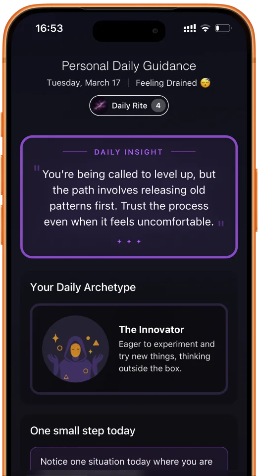
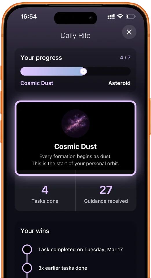
Whiss: six symbolic systems, one clear daily read
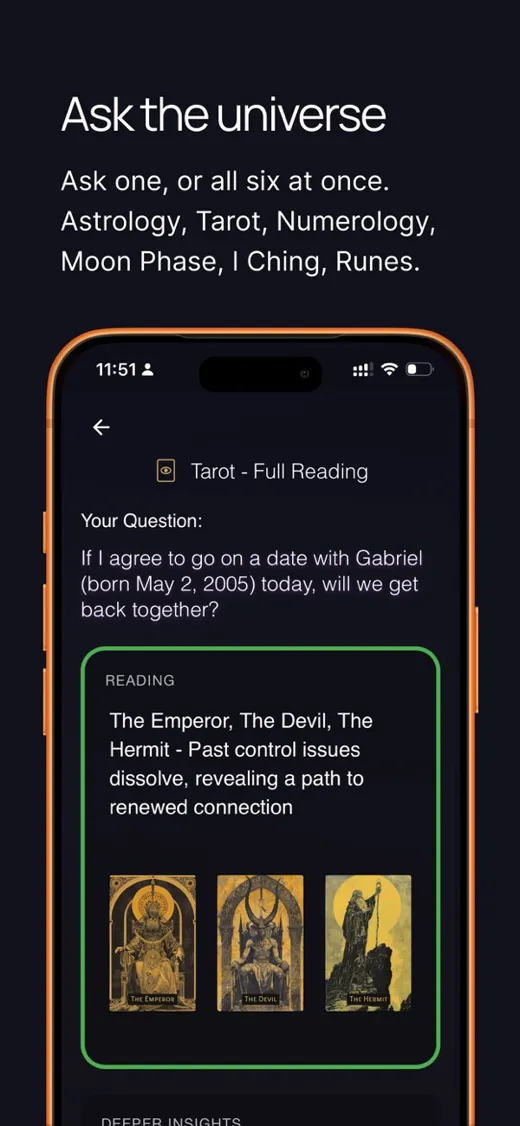
My own product, built solo from the first idea through specs, reading algorithms, illustrations, design and code. It merges astrology, tarot, numerology, runes, I Ching and moon phases into one calm, practical daily guidance, designed to be safe for the people who rely on it.
Complex SaaS, from first workshop to shipped product
Before cybersecurity I spent a decade on data-heavy business software: supply chain, customer success, healthcare, fintech and hospitality. Open any project for the full story.
Orchestr82020 – 2022
A cloud platform for demand-driven supply chains
Sole designer on a new cloud platform: 200+ screens, 30+ components, one clickable prototype for every use case.
UK startup2021
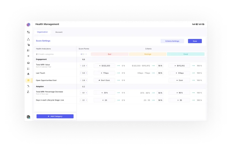
Health scoring anyone can configure
Health management and a configurable stat bar for a customer success platform, validated with a full prototype before code.
PlasmaStreamHealthcare
Administration for plasma centers
A new admin for an existing donation platform: a style guide, complex new sections and a responsive version of every screen.
PlasmaStreamHealthcare
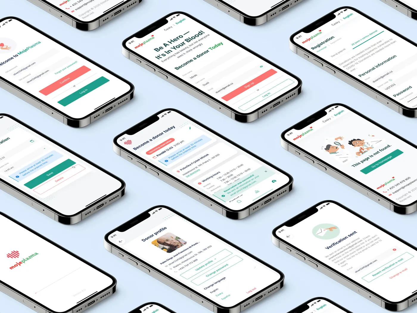
Plasma donation, from frustrating to pleasant
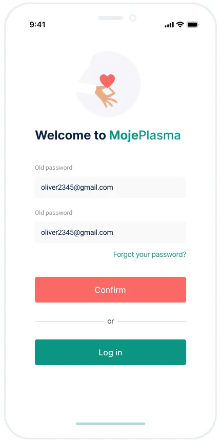
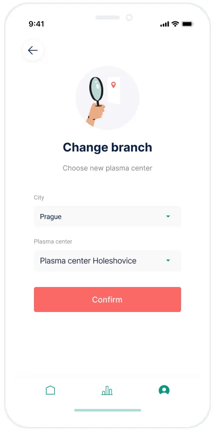
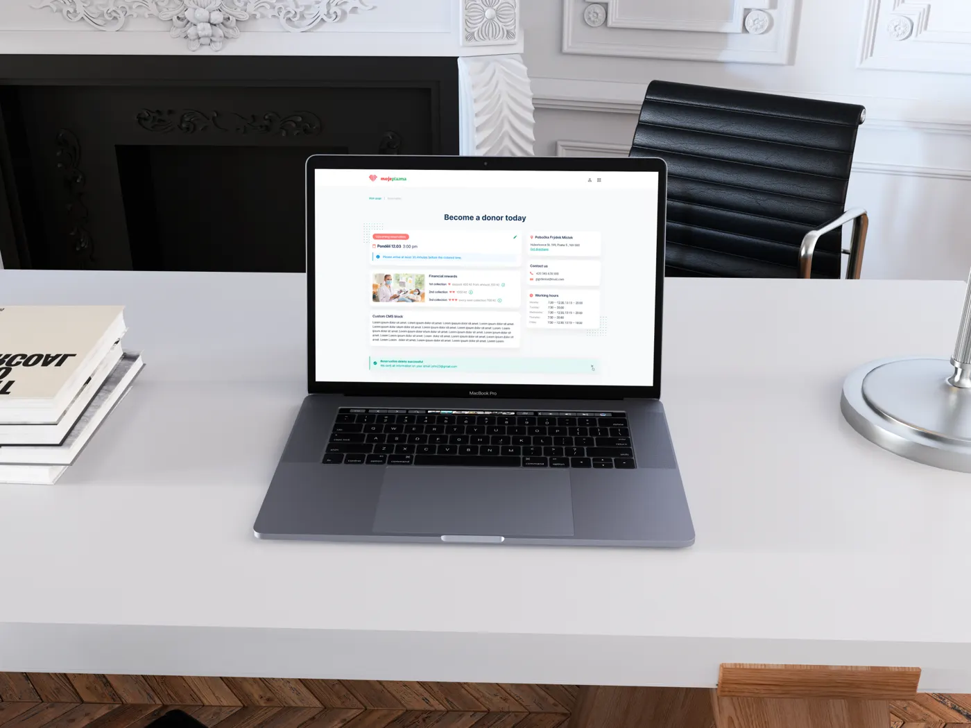
A donor app and website that make every step of donating clearer, from booking to the donor profile.
FintechAgency project
A payment app that keeps spending under control
Mobile and desktop app for an e-commerce payment method, plus a website redesign, SEO pages and campaign visuals.
Approach
What I believe about systems and teams
These are the ideas I bring into every role. Each comes from something that worked, or something that broke.
system.product
A design system is a product, not a file
It has users, a roadmap, support and QA. Treat it as a living organism that adapts as the company grows, or it quietly turns back into a folder of components nobody trusts.
system.a11y
Accessibility is the business case
It opens government contracts, reaches the 15% of people living with a disability, and reduces legal risk. Framed that way, it is what gets a system funded, and it makes the product better for everyone.
system.tokens
Tokens are the shared language
Semantic names that designers and engineers both understand remove a whole category of handoff questions. Naming is architecture, so I spend real time on it.
system.people
Build the team and the process, not only the parts
Clear ownership, a federated contribution model and docs where people already work. The system scales when other teams can extend it without asking permission.
How a project runs
Discovery workshops
Research
Journeys & IA
Prototyping
Validation
UI design
Dev support
Iteration
Experience
Since 2007, from agency to platform
Agency years taught me range and speed. Product years taught me depth and patience. Both show up in how I lead.
2016 – 2019Lead UX/UI DesignerACTUM Digital · User TechnologiesDigital R&D agencies · CZ, US
2013 – 2016CEO & UX/UI DesignerJuicyLabDigital agency I ran · CZ
2007 – 2013UX/UI DesignerFreelanceAlongside studies at the Czech Technical University
Brands I've designed for
CrowdStrike
SentinelOne
Gen (Norton, Avast)
T-Mobile
Mews
METRO
Garnier
Raiffeisenbank
ČSOB
Slovenská sporiteľňa
Mall.cz
RegioJet
Conrad
Wüstenrot
Al Baraka
Deltatre
Linet
Walmark
Gambrinus
Yachting.com
and 15+ more
About
About Oliver
People describe me as approachable and collaborative. I like hard, messy problems, and teams where everyone can say what they think.
Writing & speaking
I write about design systems and tokens on Medium ↗, speak at design meetups, and ran SentinelOne's design meetups in Prague.
Where I'm useful
Startups that need foundations, and mature products that need to untangle years of growth. Both are systems problems.
Background
Built my career in Prague, then Amsterdam, now Barcelona. Studied at the Czech Technical University's Faculty of Nuclear Sciences, ran my own agency, and still write front-end code when it helps the team.
Off screen
I write and record music as The Avenues, and I'm a very enthusiastic beginner at tennis.
Contact
Got a tangle? Let's talk.
Hiring for design leadership or design systems, or want the full CrowdStrike and SentinelOne stories? Write me a line.
From design system foundations to one unified graph
I started in CrowdStrike's design system team, where I defined the system's architecture and built it together with a great team. Then I moved to the graph team, which owns how the platform shows relationships between entities. The graph isn't a single component but a large infrastructure. Acquisitions had left the platform with several graph experiences, each with its own use cases and its own technology underneath. I initiated and championed One Graph: the vision of a single, unified graph foundation that can replace them all, and I've been driving it together with the team.
Chapter 1 · Design system
Audited the previous system: too limiting to adopt, and so memory-heavy it slowed everyone down
Set the foundations: how components are built, how tokens and their semantics work, and how the system and its files are structured
Aligned with management and the design VP, then wrote the guidelines for building components right
Built the components with the team, plus a way to ship changes without breaking anyone's files
Defined the rules of flexibility: when detaching is fine, what belongs in a component, when to use slots ↗, and what to do when a component is missing
Led the initiative and mentored the designers building it
Chapter 2 · Graph & data visualization
Initiated and championed the One Graph vision: a single graph infrastructure to replace separate graph experiences with different use cases and frameworks behind them
Drove it with engineering and product from vision to implementation: one interaction logic and one semantic model for nodes and connections across the platform
Made it flexible enough for any part of the product: each team gets a graph configured for their use case, with only the relevant features on and the right layout from the start
Help every team adopting the graph understand what they need, and unblock them fast
Mentor every designer on the team, and define its processes and automations
Work with the other canvas-based teams on a shared future and a shared language for canvas and data visualization tools
Ask me about token semantics at platform scale, designing components for memory efficiency, shipping changes without breaking files, and bringing several graph stacks onto one foundation.
SentinelOneApr 2022 – Mar 2024Product Designer, then Manager, Product Design
Establishing a design system, and the team behind it, for a top-tier cybersecurity platform
I set up a new design team in Prague to transform the company's platform and create a scalable design system. We built it as a living organism that keeps adapting to the company's growth. Over time the scope grew to include accessibility, localization and new navigation, for a global audience.
The problem
Several design systems had grown organically and through acquisitions. Each acquired company brought its own typography, colors, components and navigation.
Why it mattered
Poor user experience, high maintenance costs, low product quality, limited accessibility, slow development and restricted sales opportunities.
The objective
Build a design system team and the processes to create and maintain one unified design language for every product in the company.
My role
Proposed the system, sold it, shaped it and built the European team that delivered it. Earlier, I designed the MDR tool for internal analysts.
What I did
Designed the MDR tool that internal analysts use for managed detection and response
Proposed a new design system on my own initiative and sold it to several VPs through frequent leadership changes
Designed its foundations: semantic tokens, a core UI kit, federated libraries and three-tier docs
When the company moved to a new platform, helped shape its structural decisions from the design side
Built SentinelOne's European design team from zero. It is still thriving and takes on the toughest problems
Organized design meetups in Prague to put the team on the Czech design map
Delivered the proof of concept for the company's first AI product
The turning point. A design system is hard to sell as a cost center. It clicked when accessibility became a requirement for EU and US government contracts. A nice-to-have became a legal and business necessity, and the system became the way to get there.
Getting buy-in
A design system is a long, expensive initiative, and at first glance it doesn't make money. The shift came from reframing it: inconsistent UI was costing millions every year in wasted time and maintenance.
Leadership changed several times, and each new director and VP had different goals, so I had to keep making the case. The tipping point was accessibility. When it became essential for EU and US government contracts, the system went from nice-to-have to a legal and business necessity. Accessibility also opened the product to the 15% of people living with a disability, and removed the risk of fines.
The longer a company waits, the more a system costs to adopt. That argument, backed by numbers, is what kept the initiative funded.
Exploration
After a decade in operation there were no mapped user journeys, no pattern library and no meaningful component library. There was one disorganized Figma file where anyone could add, change or break components, with no QA, consistency or accessibility checks.
I talked to stakeholders, PMs and executives, mapped the key user journeys, cataloged the components and found the most complex parts of the UI. Then I introduced a style guide and applied it to the hardest pages first, so every decision was tested against real use cases. As the team formed, we planned for the bottlenecks ahead so the processes could scale.
Architecture
The system had to serve designers and engineers equally, so the architecture was built for both audiences.
How the system was layeredcore · federated · docs
Foundations
Styles & design tokensSemantic naming aligned with engineering
One central library with styles, core components, hidden sub-components and guidelines. It introduced ideas that became the foundation for later systems.
Styles & tokens
A semantic naming convention for design tokens, aligned with engineering standards, so both sides talk about the same thing.
Library management
A federated model: core libraries managed centrally, while product teams own non-core libraries like console patterns and data visualization.
Documentation
Three tiers: quick references in Figma flyouts, detailed component pages, and full guidance in Storybook for designers and developers.
The European team I built from zero grew into the company's central design hub. It is still thriving and takes on the toughest problems. To grow its reputation, I organized design meetups in Prague and put the team on the Czech design map. Along the way we also redesigned the MDR product and delivered the proof of concept for the company's first AI product.
Want to go deeper? I'm happy to talk through the decisions and trade-offs behind this project on a call.
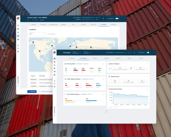
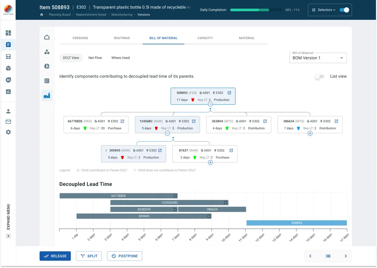
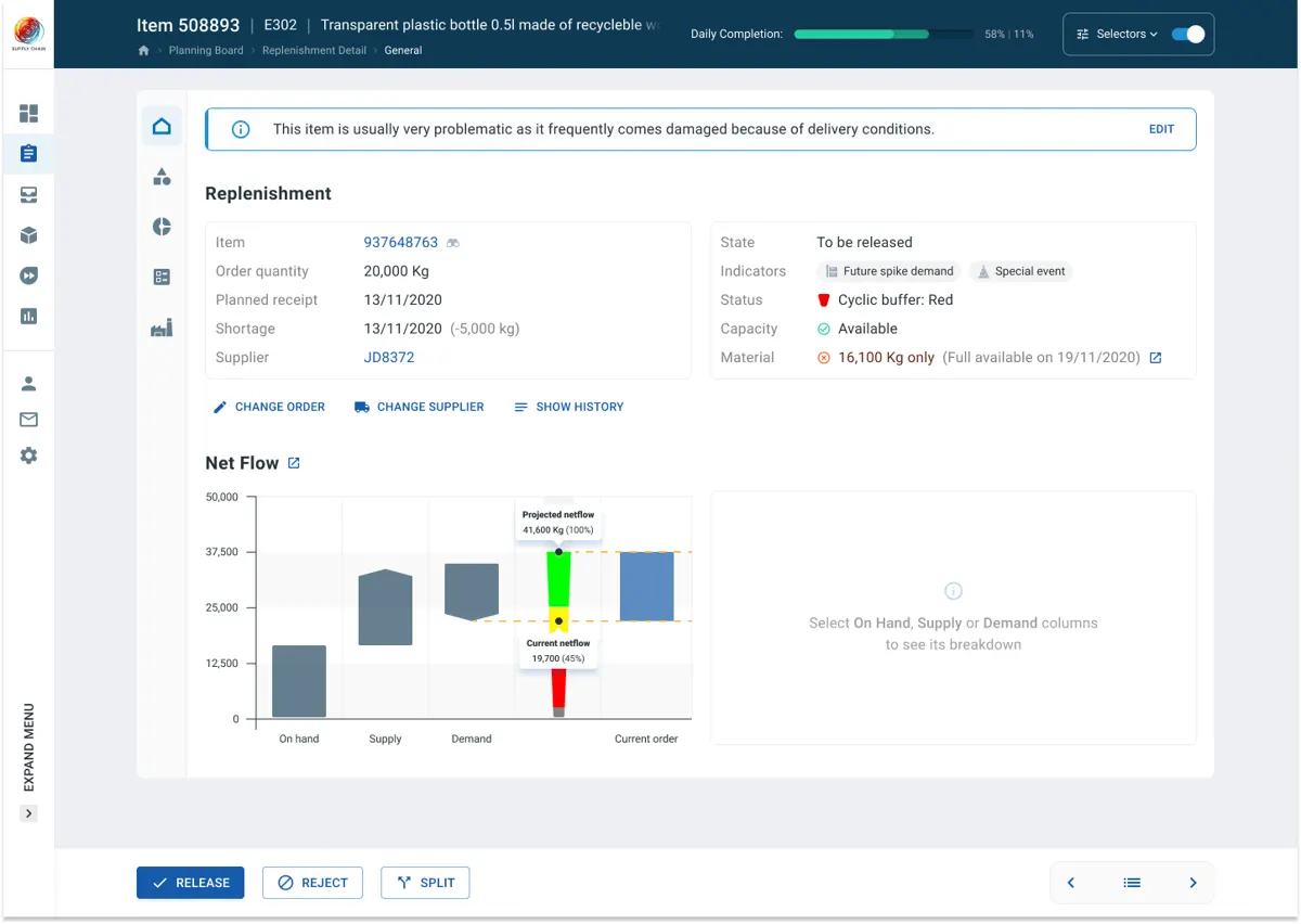
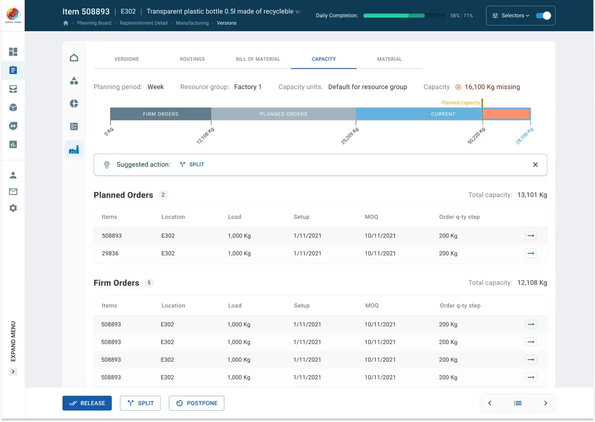
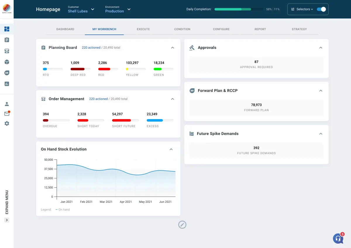
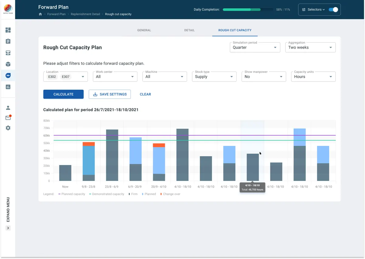
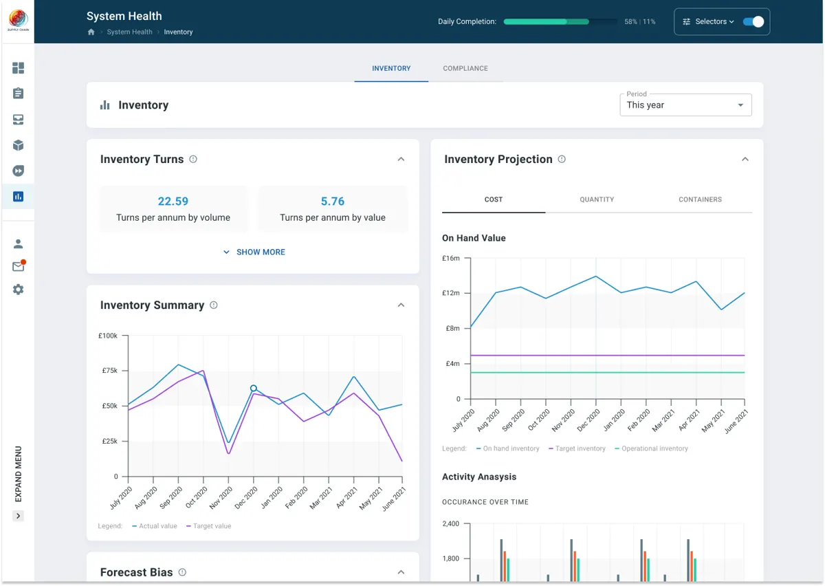
I designed the new cloud version of a DDMRP supply chain platform, alone, from the first workshops to development support. The result is a fully working cloud platform.
200+screens
30+components
6main sections
5on-site workshops
Locations and lanes for a single item
A weekly rhythm with the experts
Discovery
Each sprint started with the industry's top DDMRP consultants. I presented hypotheses and possible solutions, then had a week to design them.
Validation
Real clients are hard to reach in this business, but the best specialists were on the team. At the end of each week I validated the designs with them and improved them.
Proof of concept
Every use case was wired into one clickable prototype so the team could try to break it. If they can break it, I can make it better.
Users
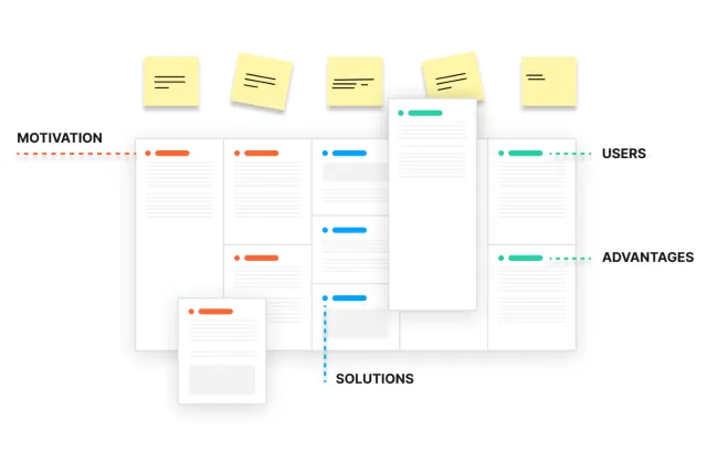
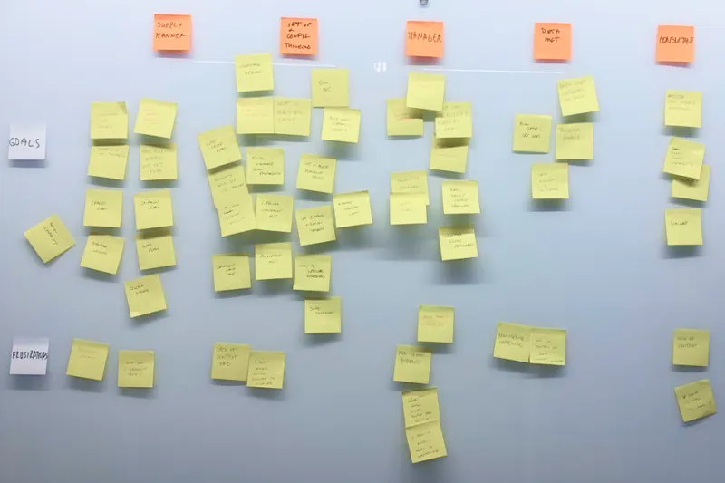
Personas and user journeys, kept loose on purpose: the software orchestrates the journeys, so optimizing them sprint by sprint was the key to success.
Personas and journeys: motivations, users, advantages, solutions
Structure and look
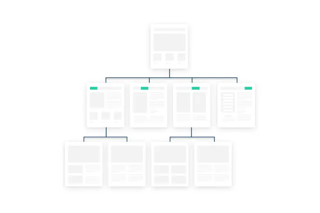
The biggest challenge was information architecture: follow the workflow, yet let people jump anywhere quickly. It settled into six main sections with a clear internal logic, a flexible layout and a new approach to filtering, balancing intuitive UI with the users' professional knowledge.
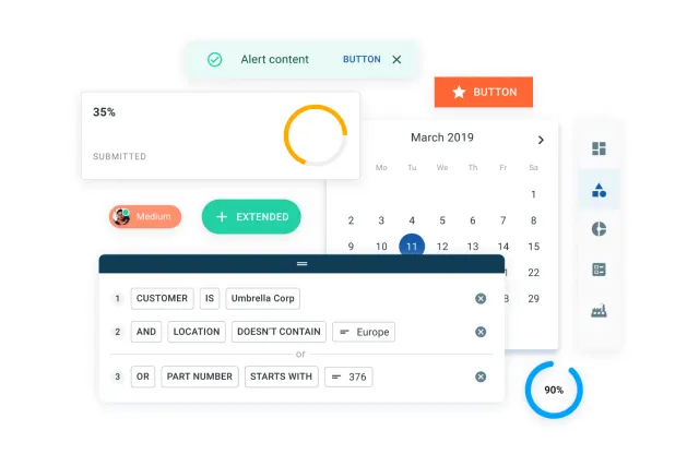
The look sits between classic business software full of tables and charts, and a modern style with bigger text, better color and a friendlier tone. With no large front-end team, I chose to build on a customized Material UI to save time.
Information architecture and the customized component set
UI design
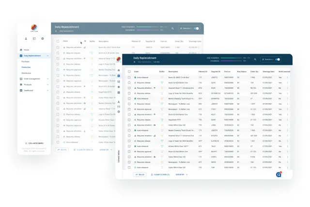
More than two hundred screens, built from over thirty components and their variations, full of complex charts and other visualizations.
Dense data, kept readable
A selection of screens
Proof of concept
Every use case on every page is wired into one large clickable prototype. In that form it's much easier to find gaps, spot better paths and land on a better solution.
Walkthrough of the clickable prototype (no sound)
Workshops
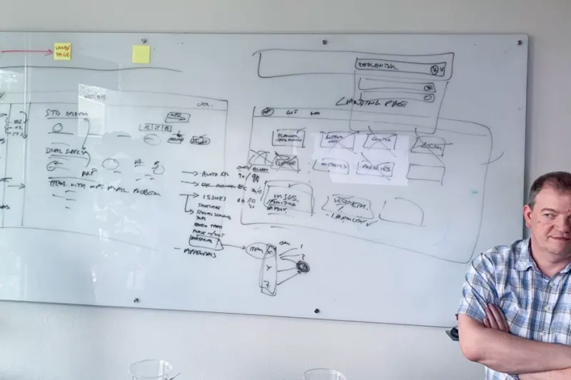
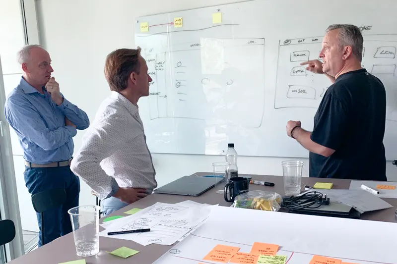
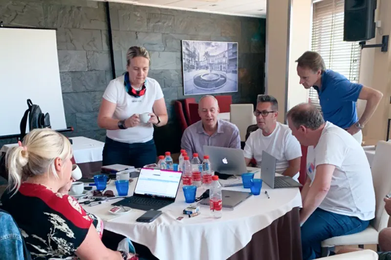
Meeting in person mattered for ideation. With the team spread across countries during the pandemic, we still made it happen: five long workshops in different locations.
Five workshops in different locations
Want to go deeper? I'm happy to talk through the decisions and trade-offs behind this project on a call.
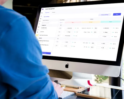
A modern customer success platform that puts operational cadence in place. I owned two parts: the health management concept and UI, and the stat bar.
How we worked
Design
I refined the specs together with the business analyst, then designed and approved the work feature by feature.
Prototype
Once the UI was ready, I prototyped every core use case and validated it in guerrilla sessions and design reviews.
Handover
After validation, I walked the developers through exactly how it should work, and we agreed together on how to build it.
Team
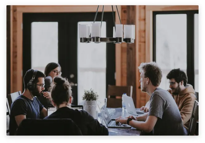
Fully remote across the UK, Spain, Czechia and Sri Lanka, with a strong vision and a process that improved with every step.
Chapter 1 · Health management
The most complex part. Users set up health measurement for both organizations and accounts. The grid gives an overview of customer health and is also where users define bad, average and good thresholds with step-by-step inputs.
Health grid with thresholds
A side panel, opened from the grid, creates indicators, sets their aggregation and period, and groups them into categories. Each indicator type has its own settings, and all of them were designed and prototyped.
Creating indicators and categories
The whole flow was prototyped, so we could play with it and validate our hypotheses.
The health management prototype in action (no sound)
Chapter 2 · Stat bar
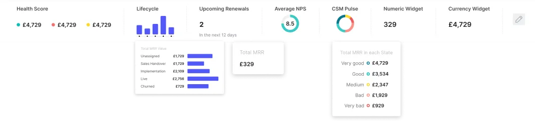
Every major section can have its own stat bar, built from a library of widgets. Users choose up to seven, each with its own settings and data aggregation.
Stat bar widgets
People
A truly international, fully remote startup that works really well. They have a strong vision and a process they improve with every step. I believe in their future, and it was an honor to be part of the team for a while.
Want to go deeper? I'm happy to talk through the decisions and trade-offs behind this project on a call.
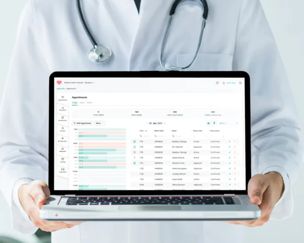
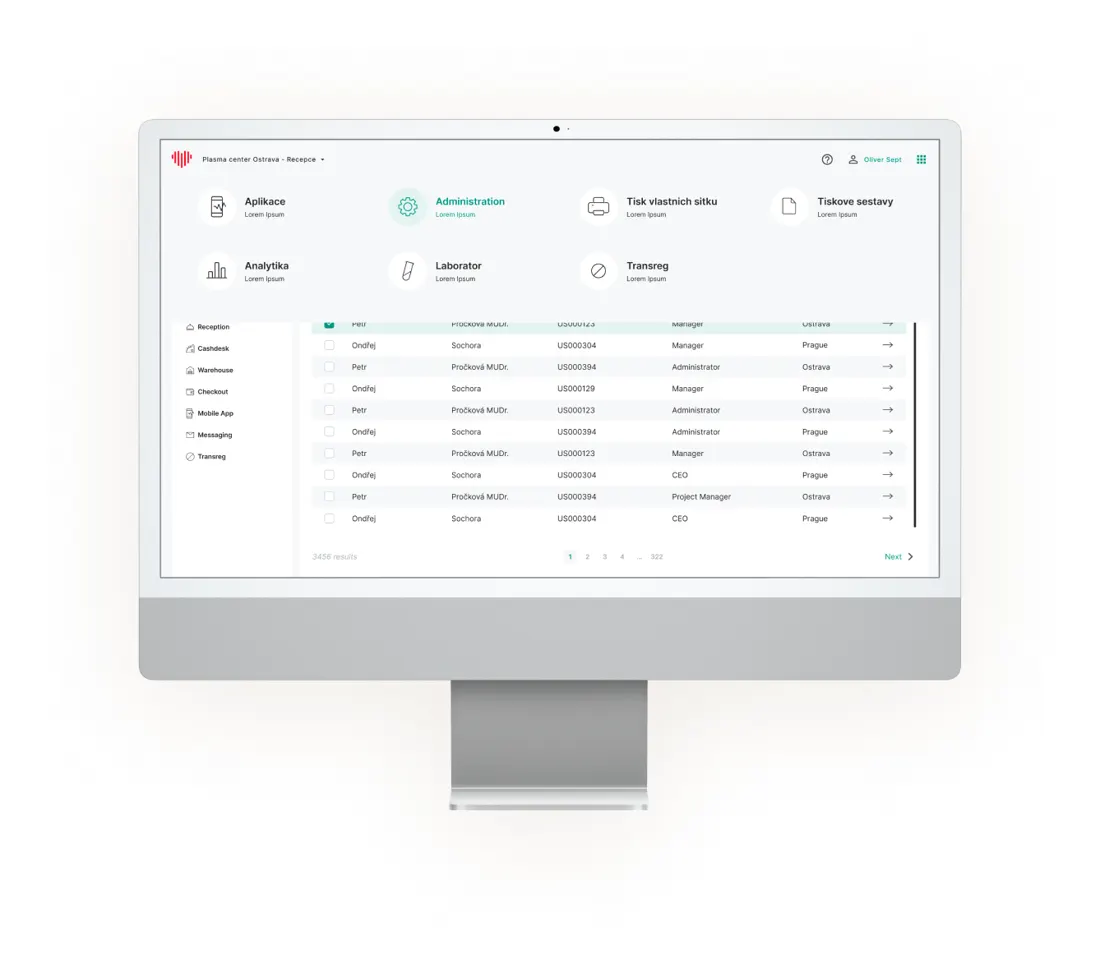
The goal was to create an administration for an existing plasma donation platform. Along the way we created a style guide, added several complex sections and partially redesigned the old ones. Great cooperation on the client side made it much easier.
New experience and partial redesign
Workflow
We started with a workshop. Once the goal was clear, every idea and task went onto a kanban board, and we met for standups and workshops three times a week.
Style guide
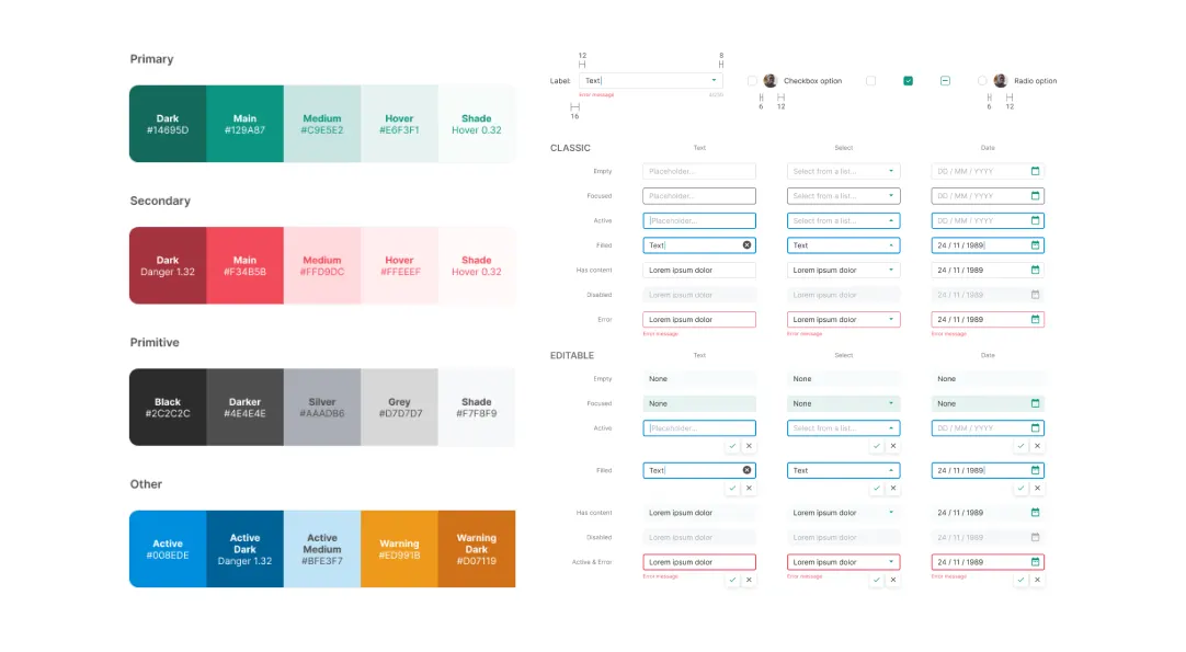
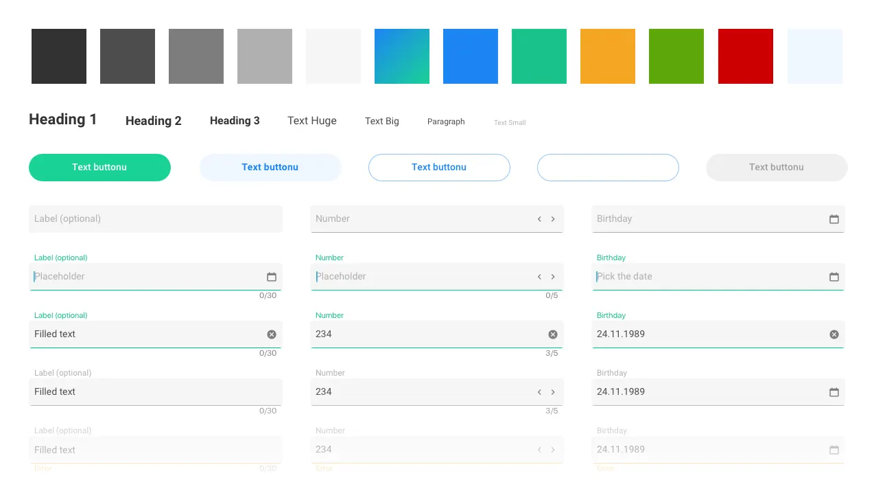
All the main atoms and components, colors and typography, including their states and measurements. Every page was then built from it.
Responsive
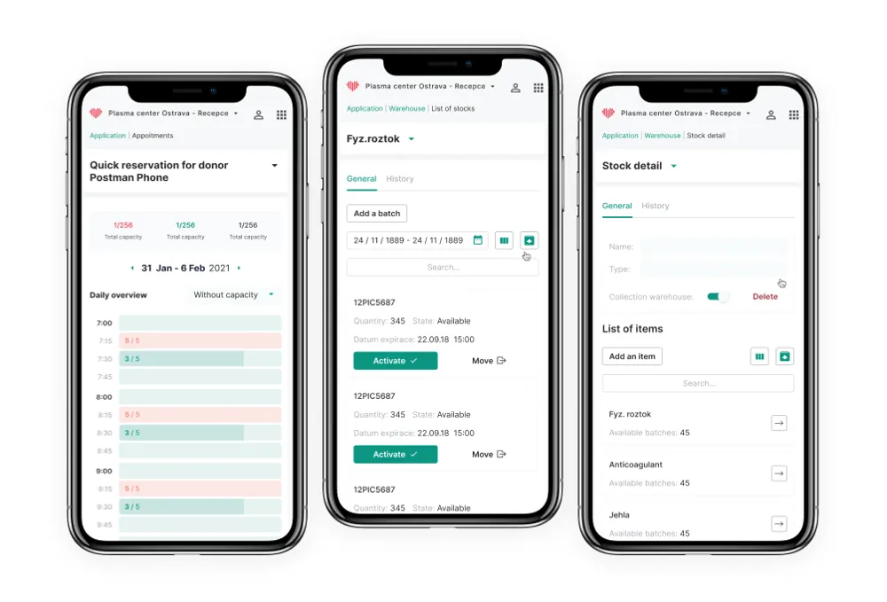
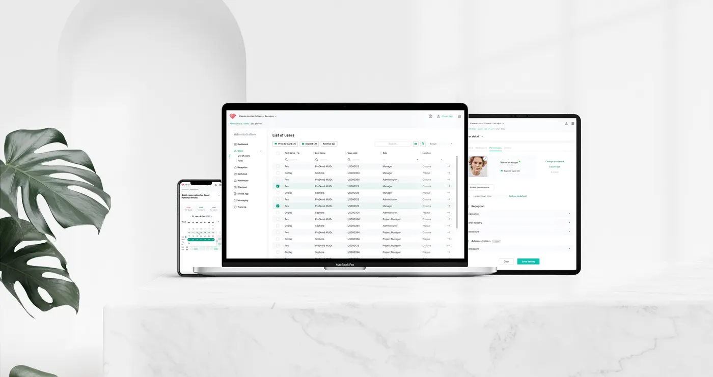
Staff rarely use anything but desktops, but it mattered to give them the option, so every screen also has a tablet and a mobile version.
Result
A well-structured responsive design with high reusability. An exemplary cooperation, and both sides hoped to continue soon.
From wireframes to the style guideAppointments overviewEvery screen, also on tablet and mobile
“We worked on a new design for the web and mobile application of plasma center administration, and the result turned out to be even better than expected. Designs were delivered on schedule, in professional quality, with high reusability for the internal team. PlasmaStream is very thankful for six pleasant and productive months, and if we get the opportunity to work together again on new projects, we will definitely take it.”Michal Kazdan · IT & Business Analyst, PlasmaStream
Want to go deeper? I'm happy to talk through the decisions and trade-offs behind this project on a call.
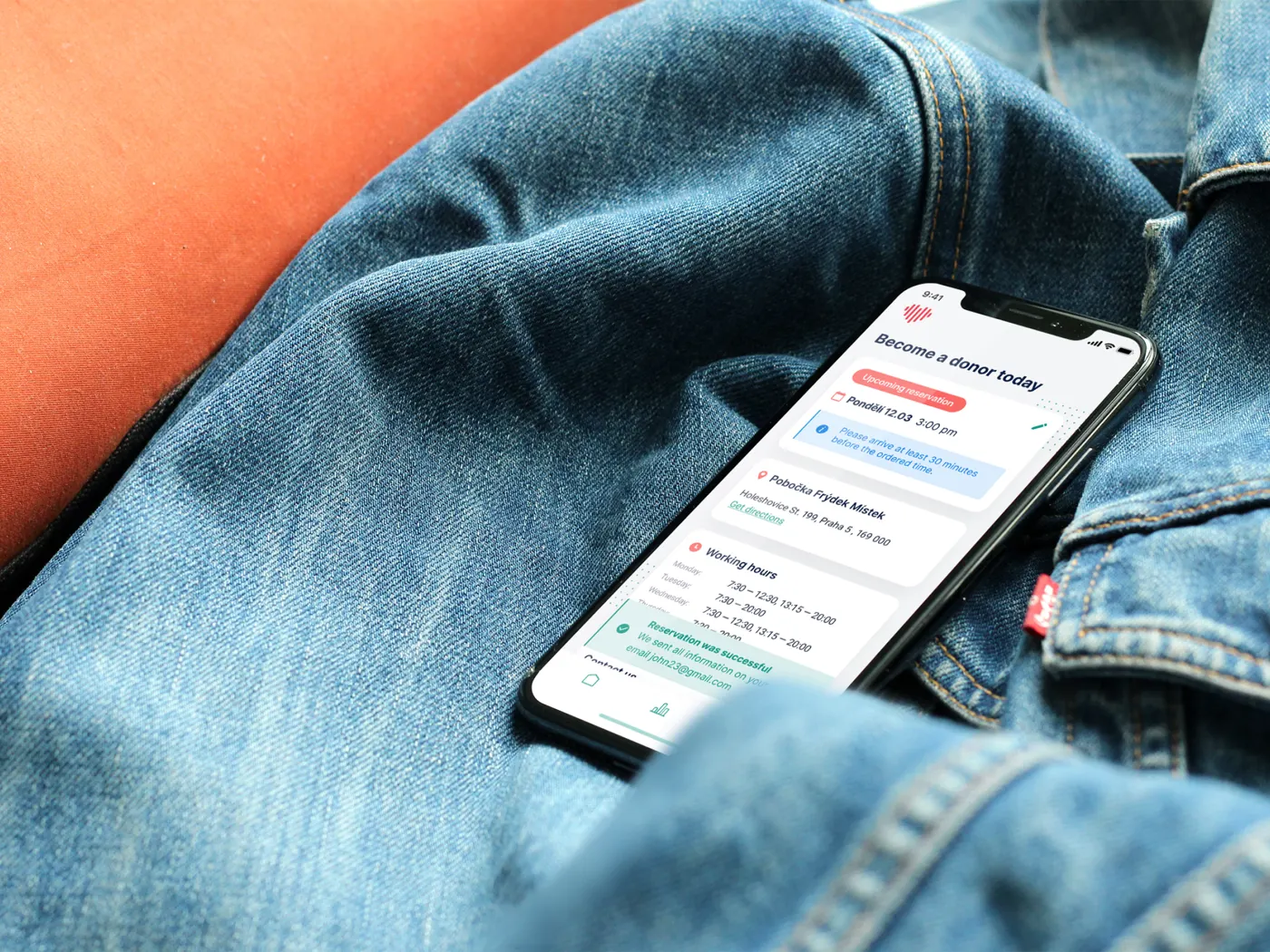
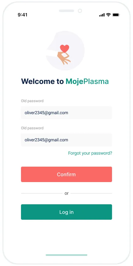
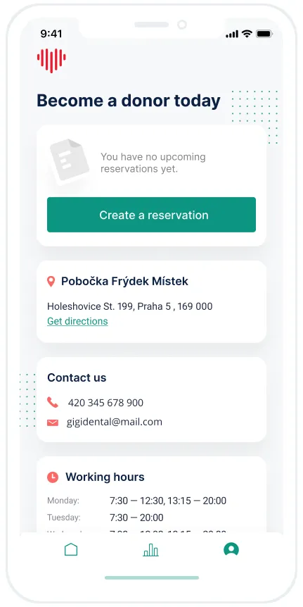
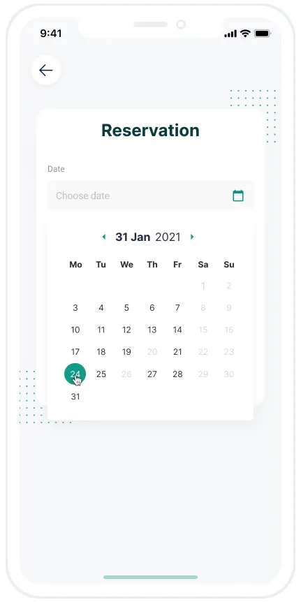
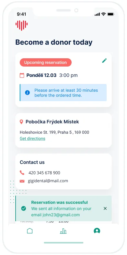
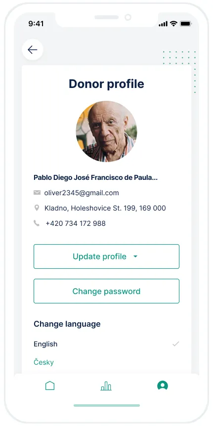
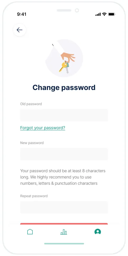
Plasma donation can be frustrating even for the best of us. What we can do is make the donor journey as smooth and clear as possible, and on this journey every detail makes a big difference: copy, pictures, color. We took care of the whole UX and UI for the responsive website and the mobile app.
Donor app screens: registration, booking, donor profile and more
App and website
A great, responsive and responsible client made this journey a real pleasure.
“We worked on a new design for the web and mobile application of plasma center administration, and the result turned out to be even better than expected. Designs were delivered on schedule, in professional quality, with high reusability for the internal team. PlasmaStream is very thankful for six pleasant and productive months, and if we get the opportunity to work together again on new projects, we will definitely take it.”Michal Kazdan · IT & Business Analyst, PlasmaStream
Want to go deeper? I'm happy to talk through the decisions and trade-offs behind this project on a call.
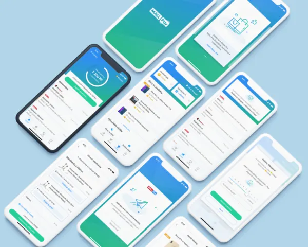
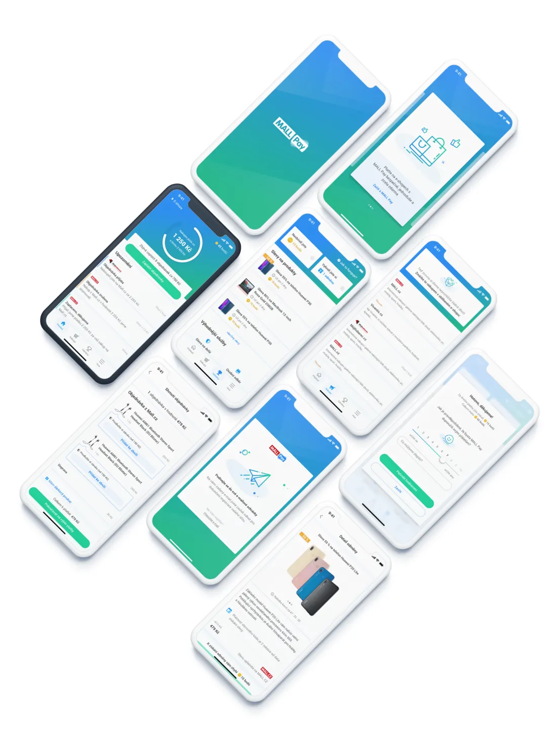
A smooth project from my time at an international digital agency. The goal was to give users of an e-commerce payment method a mobile app to keep their payments under control.
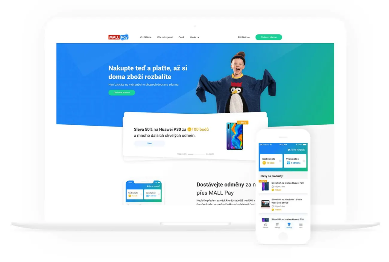
We extended the project to deliver both mobile and desktop versions of the app. After that I took care of a partial website redesign, delivered SEO pages and even created visuals for a marketing campaign.
User experience
We held several workshops to agree on the path and the idea. Even though the company already had branding and colors, I created a mood board so the direction was rock solid. Then I delivered style guides to keep every page consistent, wireframes to agree on the structure, and iOS and web designs as the final output.
Website redesignStyle guide
Want to go deeper? I'm happy to talk through the decisions and trade-offs behind this project on a call.
Whiss2026Founder · solo, idea to launchWeb · iOS · Android
Whiss: six symbolic systems, one clear daily read
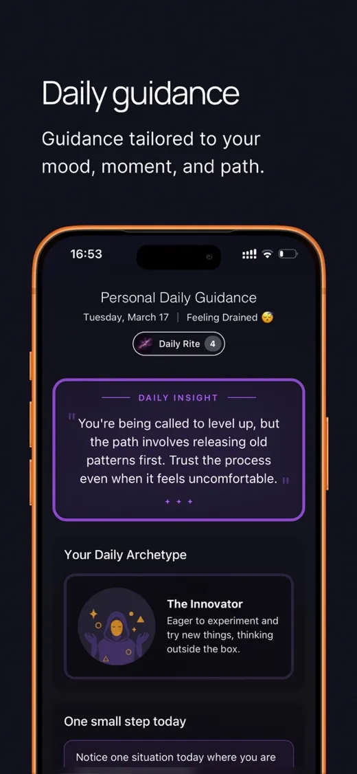
Whiss is my own product, built end to end by me: the idea, the specs, the reading algorithms, the illustrations, the design and the build. It's live on the web, on the App Store and on Google Play.
The gap
People who follow astrology often also turn to tarot, numerology, the I Ching or the moon's phases. Each source tells them something different, and none of them connect. Whiss brings six systems together, astrology, tarot, numerology, runes, I Ching and moon phases, into one coherent reading. You can also ask a question and explore it through one system or all six at once.
Deep, playful and safe
Readings go deep and stay fun: vivid, surprising and personal. And every one adapts to your psychological and emotional state, so it never lands in a way that could hurt, and never nudges you toward anything harmful or illegal. Everything points at your growth.
One small step a day
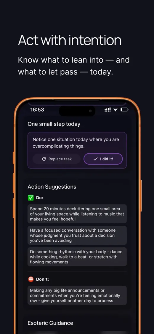
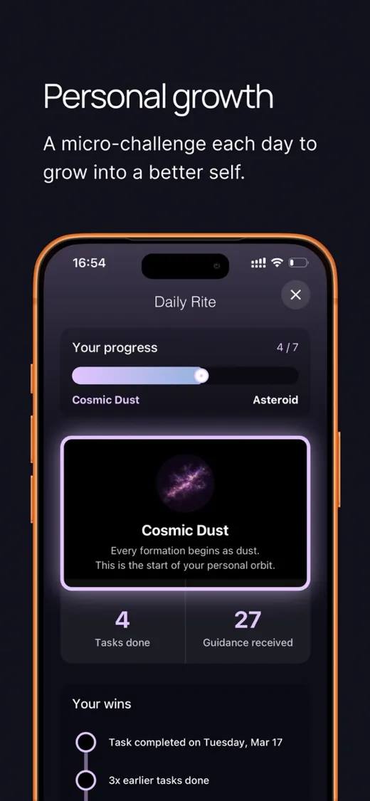
Next to the reading, Whiss gives you one concrete step to take today, a small, deliberate push to become stronger, more confident and more self-reliant. The point is that, over time, you rely on yourself more than on the app.
The cosmic archetype My own invention
Every day Whiss gives you one of 17 archetypes: a character for the day that ties all six systems into one figure you can feel. I created the concept and all 17 illustrations from scratch.
Today's archetype
Innovator
Ready to challenge the usual approach, experiment, and find a new way forward.
3 / 17
Why I built it
It started as an experiment. I'm not a believer myself, but I saw people around me looking for guidance and getting it from sources that didn't care about them. That made Whiss a great exercise in designing respectfully for people who see the world differently from me, and in shipping a real product alone.
 Own product · 2026