Demand Driven
Supply Chain SaaS
Method
Client & user discovery
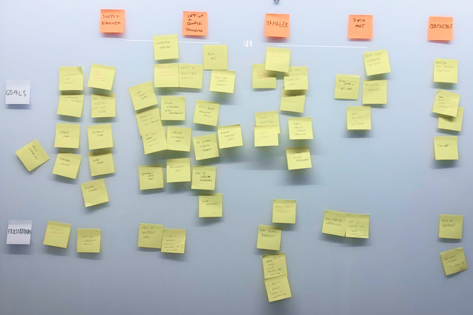
To better understand the user I prepared personas & user journeys. The journeys are not strict, as it’s the job of the software to orchestrate them and make them do what’s needed. That’s why the optimisation of these journeys is the main key to success, and it’s something we were improving sprint by sprint.
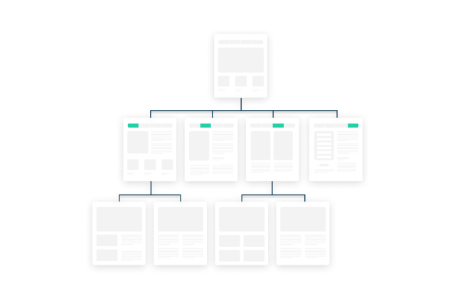
Information architecture
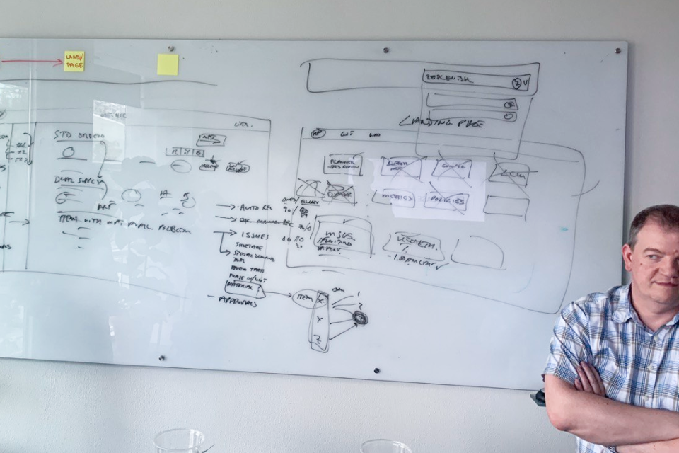
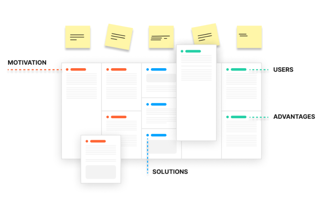
Due to the amount of information it was a huge task to come up with IA allowing you to both comply with the workflow, and allowing you to quickly get wherever you want at the same time. And every iteration we’re getting closer. Currently it has 6 main sections with pretty elegant internal discipline.
Layout
Labeling or iconization, comply with the market or innovate? The project has a very strong and flexible layout, revolutionary filtering, and a great balance between relying on intuitive UI and user’s professional knowledge. And after one year of work it still handles all the innovations pretty well.
Look & feel
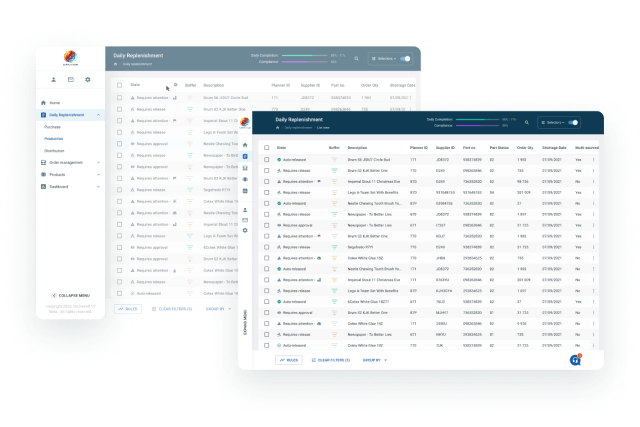
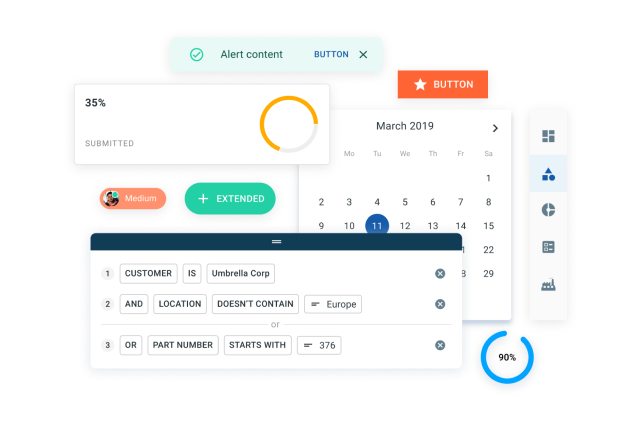
The looks & feel is a golden mean between business applications built out of texts, tables, and charts, and modern clean approach with bigger texts, better colours and pleasing tone of voice. And it’s cool for the eyes. As I was working alone on the design and we didn’t have any big FE team neither I’ve made a decision to build it on Material UI DS to save some time. It was customized though.
UI Design
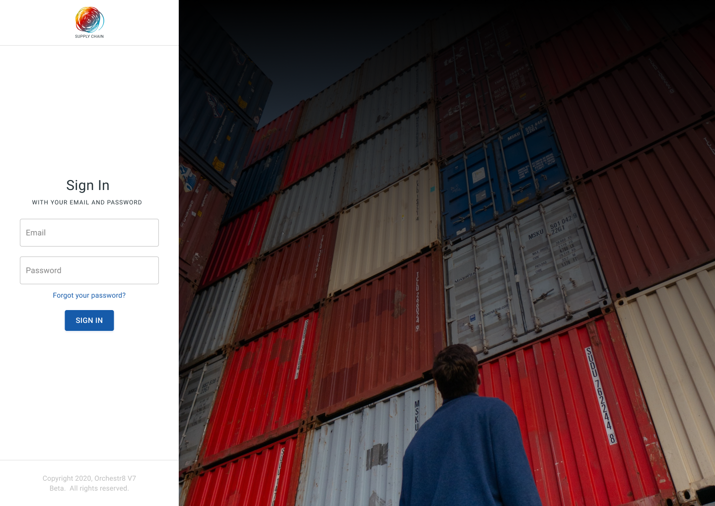
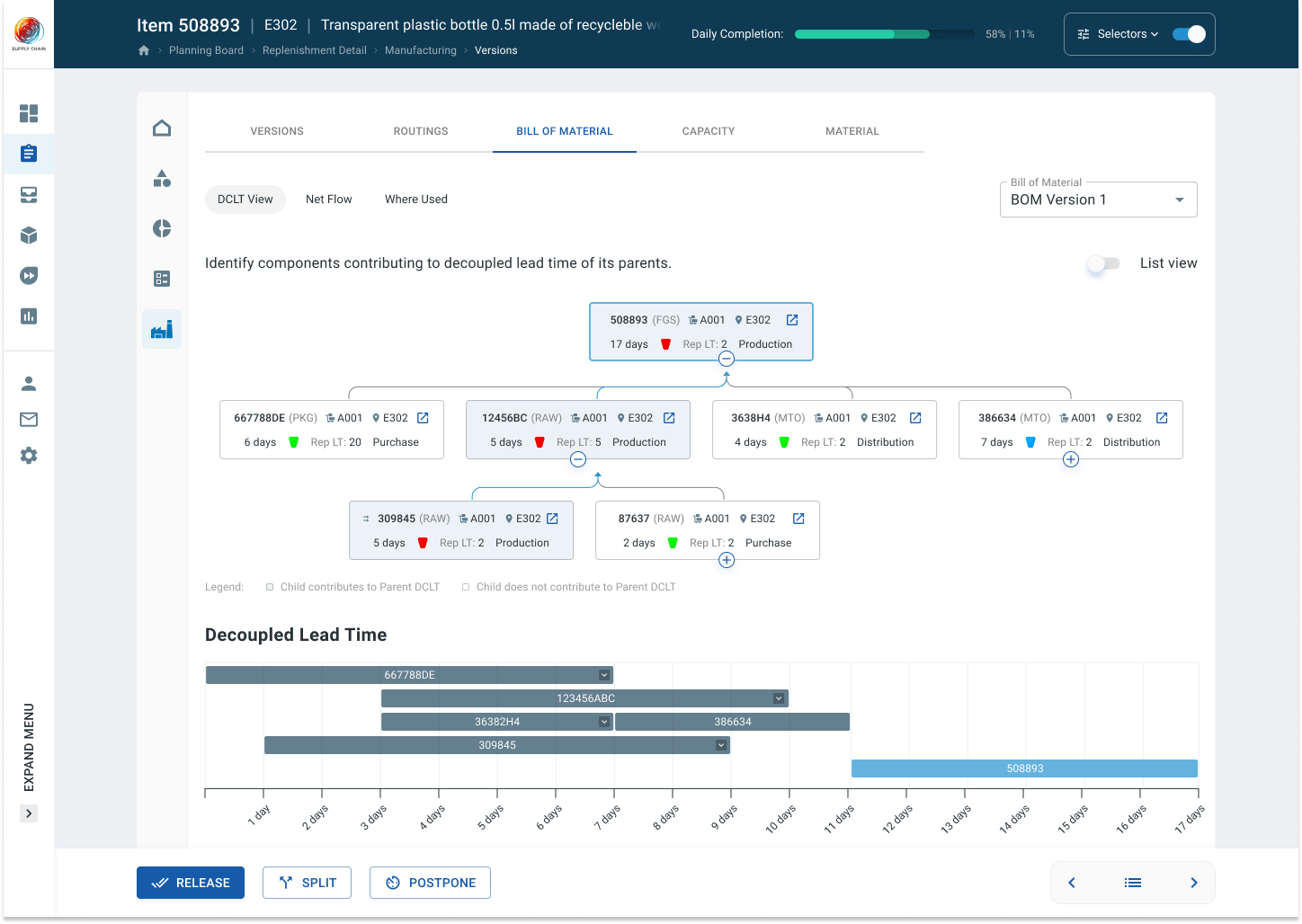
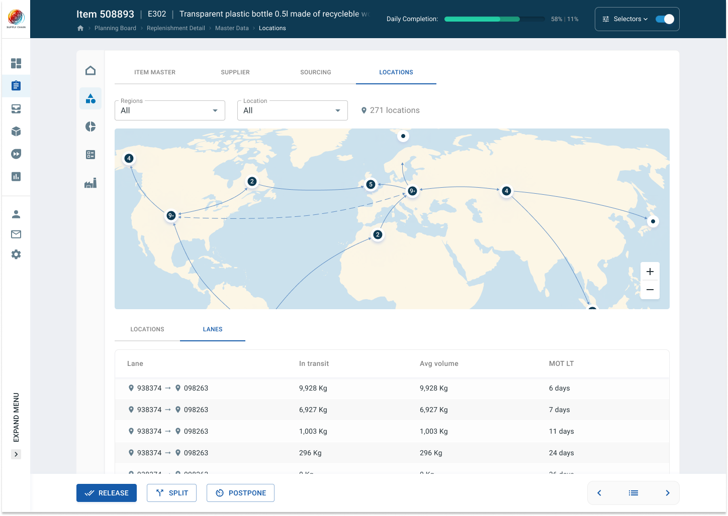
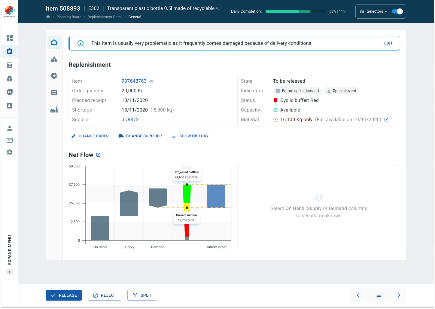
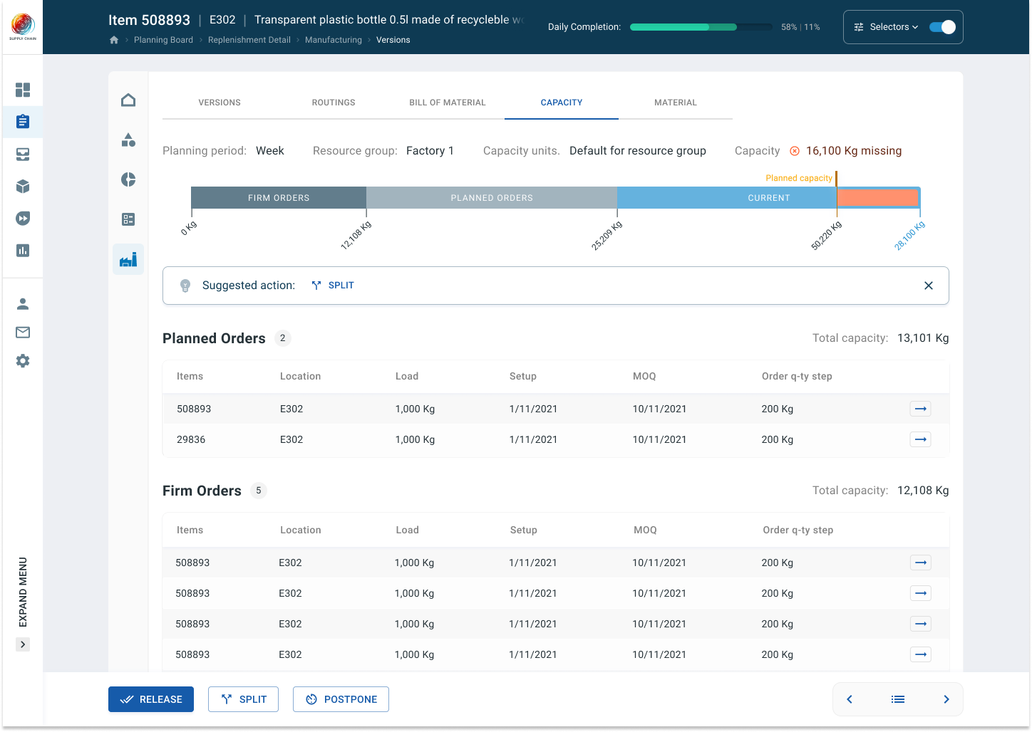
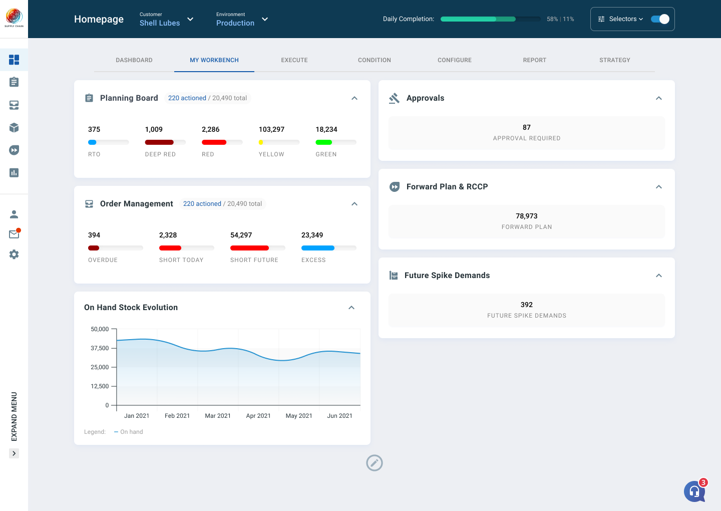
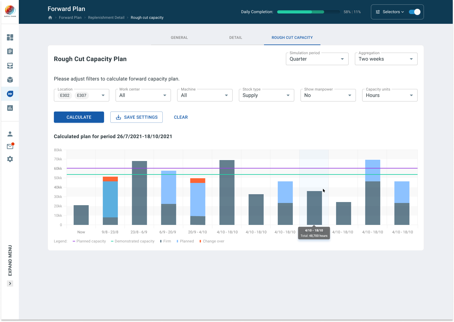
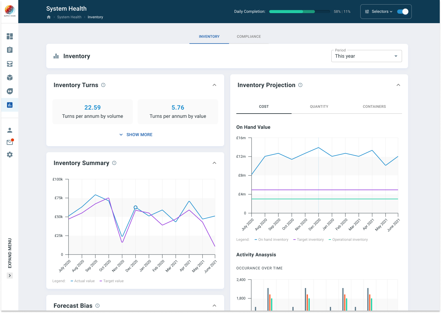
Over two hundred screens are built of over thirty components and their variations. All stuffed with complex charts and other visualisation types. Better visual can’t be presented here as it’s not released yet, but руку are few screens.
Proof of concept
The whole thing is all wired and clickable. Every use-case on every page is connected to one huge prototype. In such an embodiment it is easier to detect any deficiencies, find better ways and come up with a better solution.
The great minds in action
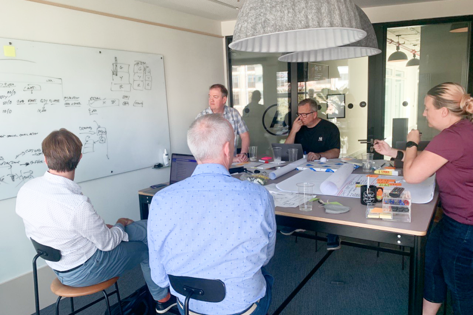
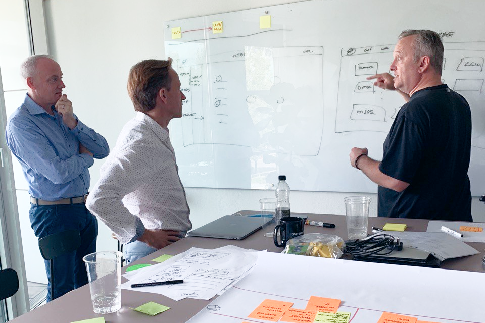
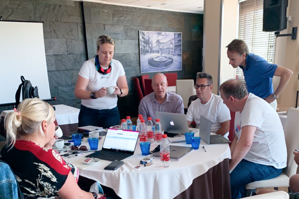
For the product it was crucial to meet in person for the ideation part. As members of the team are located in different countries it was a little tricky to organise it during covid pandemy. But we made it and had five long workshops on different locations.
Let’s do it!
Every project is special and very different in many ways. So its journey. Choosing the right people for a project though makes the journey worth it.

