
Empowering Designers with Guided Freedom, Balancing Creativity and Consistency in Design Systems
Author: Oliver Ustinovich
Core Principles
Long Story Short: Add slots—empty placeholder components—to strategic places in your design system components where users might need to insert additional content. When needed, users can select these slot layers and swap them with any desired element

Let’s start with a brief history: The concept of slots in design systems originated from the Web Components specification introduced by the W3C, where the <slot> element allowed developers to create flexible, reusable UI components. This idea was further popularized by frameworks like Vue.js, Svelte, and then React contributed indirectly with its use of children and render props, influencing how slots were conceptualized. From a design perspective, the concept of slots aligns with principles of modular design and atomic design, allowing creating flexible and scalable blocks.
Now, let’s get to it: Imagine a Dialog Footer component in your Design System with a Cancel Button on the left and a Primary Button on the right. This is your standard layout. However, sometimes you might need to add extra elements like infographics, secondary buttons, or warning messages. These you don’t use very often, they are considered edge-cases.
Do you want to have all the edge-cases available in your design system? The answer is usually no. Even if you could anticipate all the edge-cases, it would significantly increase your memory footprint. Instead of publishing one modular component to your design system, you’d end up with a large set of variants that most users won’t need. This approach will sooner or later overload your design system and bloat your end-users’ Figma files.

Instead of trying to include all possible variations in your design system, you can use Slots. A Slot is a component—often hidden, but sometimes visible—that can be easily replaced with any needed element. For example, the footer component above could be built using a Slot positioned to the left of the Primary Button.
While it’s impossible to completely prevent component detachment in a design system—unless we’re building a utopia—Slots help minimize it. By predicting where customization might be needed and placing Slots there, we make the system more flexible. Slots can accommodate edge-cases (Edge-Case Slots) and also provide a list of components you might want to use in places where content is mandatory, such as the dialog body (Common Use-Case Slots).
Edge-Case Slots
The slot type used in the example with the Dialog Footer above is called an Edge-Case Slot. These slots make your interfaces more scalable and future-proof, preventing component detachment when edge cases arise.
In design systems, we often grapple with a challenging balance: user freedom. The more freedom you give for design interpretations, the less consistency you achieve.
Developing this method was a game-changer for me. It introduces a concept of “Guided Freedom.” You allow designers to explore and enjoy the creative journey while providing rails to the destinations worth going.

While you can’t anticipate all possible use-cases, you can designate areas where end-users are allowed to add extra content. These slots serve as certain guidelines, indicating where it’s acceptable to include additional elements when needed and where it’s not.
To implement this, simply add a slot component to the desired location and hide it by default.
You can enhance discoverability by adding slots to your component properties. Include both Appearance and Instance Swap properties. This allows end-users to easily find slots, activate them, and replace them with their chosen instances. However, this approach requires a separate slot component for each location, since activating one slot will activate all instances of that component used within the parent component. I prefer just hiding them in layers. When needed, users can easily find them and quickly get used to the system.

Sometimes you might even want to suggest what these slots can be replaced with, if some of these edge-cases are repeating more often. To do so, simply keep your Slot component and these suggested components in the same folder (you can add folder structure to their names, e.g., Footer / Slot, Footer / Warning, Footer / Notification Toggle). Then, in the Instance Swap, you’ll see all the relevant components listed right away. I call these “Common Use-Case Components.” The next chapter will explore the full potential of this concept.
Common Use-Case Slots
Some components are designed to have more diverse content in their body. Examples include e.g., Dialog, Accordion, and Drawer. These components need to offer a method for inserting this content. This is where slots become handy and serve as the primary content distribution method. We can take this concept even further. As mentioned earlier, we can provide design system users with a list of components they can use by placing them in the same folder as the slot.

Let’s consider a Drawer component in the design system. Imagine this often usually having same three main elements in its body: a Card, a Tree, and Tabs. To make it easy for users to add these elements, we can place them in the same folder as the Drawer’s content slot. This simple organization allows users to quickly swap the content Slot with the right component using Instance Swap. It’s a straightforward way to customize the Drawer’s content.

This doesn’t mean you can’t swap it with any other component, including your local ones—it can be anything. It simply provides users with easy access to commonly used components.
Unlike Edge-Case Slots, we don’t want to hide this type of slot. Their use is typically not optional—we can’t have a Dialog or a Drawer without any content., can we?
Solving Layouts in Design Systems
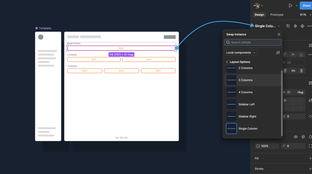
With this concept of guided freedom using Slots, you can go beyond edge-cases and distribution methods for Dialogs. Hear me out—what if your common page template can have more than one column? You can have one page with a left sidebar, one with the right sidebar, and one with 4 columns. There is a way, and we can make it really cool and easy!

The first-level components on the page can define the layout structure. When clicked, they suggest available layout options. Each layout component contains its own Slots with suggested content options. I know it’s starting to sound like Inception movie a bit, but it works beautifully.
Here’s how to use it: First, select your layout component, then choose appropriate components for each column. Just like in the picture below.
Building a Slot Component
- Create an auto-layout frame and save it as a component.
- Add placeholder text like “Slot” or “Swap Me” to guide end users on its purpose.
- For Edge-Case components, keep them hidden; for Common Use-Case Slots, make them visible.
- For better scalability, create separate slots for each location type rather than reusing them extensively.
This is a powerful yet simple technique with many possible approaches and interpretations. Use whichever works best for your needs. Material UI recommends a similar approach in their guide on Flexibility with slots. For an interesting alternative perspective, check out Danil Kovchiy’s book Images And Models (in Russian), which presents a contrasting approach to slot-based design system architecture. Let me know in the comments which approach worked better for you!
That’s all folks! I hope this article helps you slot more happiness into your design system. And remember, if you’re ever feeling stuck, just think of these slots as the Swiss Army knife of design systems – they may not make you coffee, but they’ll solve pretty much everything else! Thanks for reading. 🎯
